How to develop a product concept in hours
In my work as product owner for digital products in the automotive space, I started to create a process to develop a solid product concept and wireframes within hours. Most of the time I’ve had the opportunity to work with great and inspiring product managers on these concepts. The process is inspired by various authors and their publications. I've came up with a process that you can follow most efficiently with your pair product manager or product owner. It might also work with a bigger crowd, but they should have experienced the process with you once. The resulting artifacts that you'll come up with, while following the process, are a detailed sketch of the solution + your prioritized backlog to start your development process immediately. I will highlight now the detailed ToDos within each step.
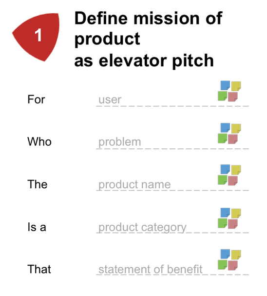
Assuming, that you came already up with a product idea, I bet, that the next step will be very easy for you. The format of the elevator pitch to define a product's mission is a pretty straightforward step to come up with a first definition of your product. This is a step that you can also take with your complete team. Just get a whiteboard and everyone starts filling with post-its the grey marked areas. You'd start with getting a common understanding of your user and the users problem. The product name and the product category help you to clarify, whether the product is an app or a website etc. Finally the statement of benefit allows you to define what emotional, functional or social benefits your users should experience. With the help of the mission you'll be easily able to deviate related functions and and designs of your product. Take 10 min. to define the mission by every participant and additional 20 min. to come up with a coherent understanding of the product's mission. Remember, that this is only the first shot of your product, and you'll laugh about it in a couple of months, weeks or even days.
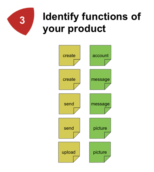
Having defined the mission of the product, you can now identify the major elements and activities. In his book "well designed" John Kolko shows a simple and very effective way to identify elements and activities of the product. When I asked team members to participate in the exercise, everyone was a bit skeptical in the beginning, but happy with the results afterwards. In a quick 10 min. brainstorming, you come up with nouns and verbs that you associate with your product. By simply dropping them, you'll identify the elements and activities, that are embedded in your product. The example shows a very simplified view on the nouns and verbs related to a messenger service.
The next step is to combine the elements and activities of your products, so that you come up with functions. It's pretty easy, as you just combine the activities (verbs) with the elements (nouns), that make sense to you and your idea of the product. While matching, you'll figure out, even more nouns and verbs. And you'll get very fast to a comprehensive picture of the product. In one of the later steps, you can easily deviate user stories, that your team should focus on. By following the messenger example, you can see various functions of the app (create account, create message, send message, etc.).
The next step is the identification of the hero flows within your products. These are the flow of first time usage and the main functions, that users will use. In this example, the creation of a user's account will only occur once. The first user flow is important for your product, as you want to ensure, that your user gets onboard very easy. If you confuse him at this moment, he/she will probably not come back again. The main user flow, is the flow that has the highest value and frequency in use. The design of these function is crucial to secure a retention of users. If you want to ensure, that your users are coming back again and again, you better design those activities with high intensity. After you've identified the hero-flow activities, it's now time to sketch the screen that displays the main activities.
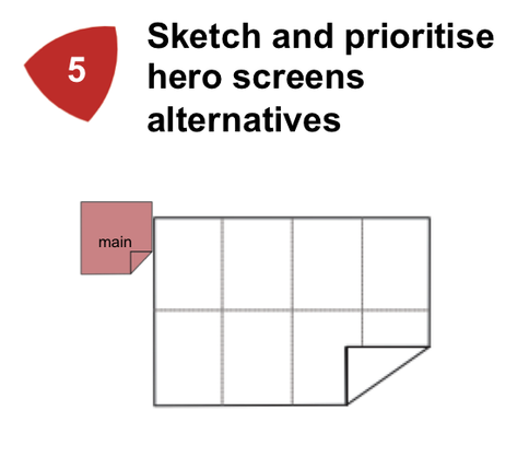
At this point you want to get as many ideas and alternatives for the main screen as possible. Jake Knapp and the Google Ventures Team suggest a pretty easy technique to get to many alternatives - called crazy 8s. Just fold a sheet (I used always A3 size) of paper until you have eight fields on the sheet. Every team member gets such a sheet and starts - the main functions in mind - sketching out eight alternatives of the main screen. Just use 10 minutes to come up with the 8 alternatives. This is 100% enough to get to this amount of sketches. They don't need to be fancy, but should display the most important parts of your users interaction with the product. If you're designing for a website or for an iPad App, it's easier to bring the sheet into portrait format. After all of your team members have sketched 8 alternatives of the one screen, you can now come to a group decision. You definitely want to capture the best ideas within every alternative, as everyone is working on the same screen. To get there, everyone has the chance to place as many dot-votes on parts of the alternatives as he/she wishes. After you and your team have identified the best parts of the main screen, you collectively define the screen. Take 30 min, as this is a very important screen for your product. It screen will be the basis for the development of the comprehensive storyboard of your product.
For the development of the storyboard, it is now pretty easy to map out the functions to the storyboard. Take a big whiteboard for this and divide it into 12 areas. Just map out the functions that you've identified in Step 3 in the different areas. You might have to duplicate some, or you might even come up with new functions. Locate the main and the 1st flow functions on the storyboard. After having the full storyboard mapped with the functions (incl. registration, login etc.), you can now start replacing the stickies with sketches. Take your time to line out the storyboard. It might take 1,5 hours to come up with a nice 1st impression of your product. As this is the basis for your next validation with your customer, you should put some thoughts into the sequence of every step. Having the functions and frames validated, you can now use this method for the writing the user stories, based on the identified functions.
This post has been originally published on the 13.03.2017 on LinkedIn
Sources:
John Kolko (2014) Well-Designed: How to Use Empathy to Create Products People Love
Knapp/Zeratsky/Kowitz (2016) Sprint: How to solve big problems and test ideas in just five days


